Keyword Visualization: The SEO Diagnostic You Need Now
Discover how keyword visualization can transform raw data into insightful graphics, helping you identify content gaps and boost your SEO strategy.

Keyword visualization is the practice of representing keyword relationships, intent clusters, and search-opportunity gaps as visual maps, graphs, or word clouds so you can diagnose site architecture problems and content gaps at a glance. If you have a seed list sitting in a spreadsheet right now, the fastest first step is to paste it into a word cloud or network graph tool and look for the clusters your flat list is hiding.
Two resources worth bookmarking before you go further: the WordStream keyword mapping template gives you a structured framework for assigning clusters to pages, and Wordcloudgenerator lets you extract top themes from a CSV in under a minute, no signup required.
Key takeaways
Keyword visualization is most valuable as a diagnostic for site architecture: the clusters your visual reveals should directly drive URL structure, hub pages, and internal linking decisions.
| Point | Details |
|---|---|
| Start with a word cloud | Paste your seed list into a word cloud tool to surface macro-themes before running full clustering. |
| Validate clusters with SERP overlap | If two keywords share the same Page 1 results, map them to one URL to prevent cannibalization. |
| Export four artifacts | Always produce a clustered CSV, mapping table, PNG/SVG, and interactive HTML for each project. |
| Map to URLs, not topics | Every cluster needs a specific target URL and a create/optimize/no-action status before handoff. |
| Wordcloudgenerator for fast starts | Upload a keyword CSV, filter stopwords, and export PNG/SVG or top-terms CSV in under a minute, free. |
Table of Contents
- What is keyword visualization and why do SEOs use it?
- How does keyword visualization actually work?
- What features should you look for in keyword-visualization tools?
- A 6-step workflow you can run today
- What to do with a keyword map once you have it
- Best practices, common mistakes, and validation checks
- A reproducible example using Wordcloudgenerator and a lightweight clustering step
- When does visualization help, and when is it overhead?
- Wordcloudgenerator turns your keyword list into a visual map in seconds
- Sources
What is keyword visualization and why do SEOs use it?
Keyword visualization turns raw keyword data into a format your brain can actually process. Instead of scrolling through a 2,000-row spreadsheet, you see a network where tightly connected nodes reveal topical clusters, a scatterplot where the upper-left quadrant shows high-volume, low-difficulty wins, or a word cloud where the biggest terms tell you what your audience cares about most.
The SEO outcomes it drives are concrete. Visualizing your keyword set reveals:
- Topical clusters you can turn into hub pages and supporting content
- Content gaps where competitors rank but you have no page
- Cannibalization where two of your URLs compete for the same cluster
- Internal linking priorities between cluster posts and their hub
A quick site-architecture example: if a network graph shows “content marketing strategy,” “content calendar,” and “content brief template” tightly connected, those three terms belong under a single hub page, not scattered across three unrelated posts. Semrush’s keyword mapping guide makes the same point directly: clusters that group naturally in a visualization should be reflected in your site’s structure and linking strategy.
Common visualization types and what each reveals:
- Network graph: shows co-occurrence and semantic relationships between terms; best for spotting clusters and cannibalization
- Scatterplot: plots volume vs. difficulty to surface opportunity quadrants
- Treemap: shows topical share across your keyword set; useful for budget allocation
- Word cloud: fast theme extraction from a seed list or content corpus
Pro Tip: Use a word frequency analysis on your existing content before pulling external keyword data. High-frequency terms in your own pages tell you what you already rank for thematically, which gives you a baseline before you map gaps.
How does keyword visualization actually work?
The process runs in four stages: data input, processing, visualization, and export. Understanding each stage helps you avoid the most common failure mode, which is feeding messy data into a clustering tool and trusting whatever comes out.
Data inputs
Start with seed queries from your own brainstorming, then layer in Google Search Console (GSC) exports for real-intent signals, Ahrefs or Semrush exports for volume and difficulty, and site search logs if you have them. SERP feature tags (People Also Ask, Featured Snippets) are worth including because they signal intent type. The GitHub keyword-clustering project supports all of these as CSV inputs and is a useful reference for what a clean input file looks like.
Processing steps
Before any clustering happens, you need to normalize the data: deduplicate near-identical phrases, strip stopwords, and optionally apply stemming. From there, most pipelines use one of two approaches to measure similarity: TF-IDF (fast, lexical) or sentence embeddings (slower, semantic). Hybrid approaches that combine both tend to produce tighter clusters than either method alone, per the open-source keyword-clustering repo.
Then comes the clustering or graph step. Three methods dominate:
| Method | Best for | Limitation |
|---|---|---|
| K-means | Fixed number of clusters, fast | You must specify cluster count upfront |
| HDBSCAN | Variable cluster count, handles noise | Slower; needs tuning on min-cluster-size |
| Graph community detection | Relationship-first, shows overlap | Requires co-occurrence or similarity matrix |
Finally, dimensionality reduction (UMAP or t-SNE) collapses high-dimensional similarity scores into 2D coordinates so you can plot them.
Exports to request
Always ask for four artifacts from any clustering run:
- Clustered CSV: keyword, cluster ID, cluster label, volume, difficulty
- Mapping table: cluster label, suggested URL, status (create/optimize/no action)
- PNG or SVG: stakeholder-ready visual for slides
- Interactive HTML or JSON: for dashboards and ongoing tracking
Tableau’s SEO visualization walkthrough shows how connecting those exports to a charting layer turns raw cluster data into the kind of dashboard that actually gets acted on.
What features should you look for in keyword-visualization tools?
Not every tool does every job. The features that matter for a real SEO workflow are narrower than most vendor feature lists suggest.
Must-have integrations:
- GSC direct connection or CSV import (authoritative click and impression data)
- Ahrefs or Semrush export compatibility (volume, KD, traffic potential)
- Plain CSV import as a fallback for any other data source
Visual types you need at minimum:
- Network graph with co-occurrence or similarity weighting
- Scatterplot that plots traffic potential against keyword difficulty
- Word cloud for fast theme extraction from a seed list
Clustering options worth having:
- At least two methods (k-means plus one density-based or graph option)
- Auto-labeling that pulls TF-IDF terms to name each cluster
- Adjustable similarity threshold so you can tighten or loosen groupings
Export formats:
- CSV with cluster assignments (non-negotiable for mapping work)
- PNG or SVG for presentations
- Interactive HTML for stakeholders who want to explore the data themselves
Pro Tip: *CSV import plus one clustering method plus PNG/SVG export is enough for a first pass. You do not need a fully integrated platform to get value from visualizing keywords.
Tools like Ubersuggest include keyword visualization features that show related terms and search volume in a visual format. InfraNodus (by Nodus Labs) builds network graphs from keyword co-occurrence, which is particularly useful for spotting the structural gaps in a topic cluster. Keyword Clarity focuses on cluster-to-page mapping with a clean UI. Ahrefs produces scatterplot-style opportunity matrices in its Content Gap and Keyword Explorer views. Semrush’s Keyword Magic Tool and Topic Research module generate cluster-like groupings you can export. For a broader look at SEO tools and their capabilities, Toolsplorer’s SEO category is a useful aggregator.
A 6-step workflow you can run today
This workflow is sized for a project of roughly 1,000 keywords. Each step lists the artifact you should have at the end.
-
Collect keywords (30–60 min): Pull from GSC (queries report, last 90 days), one Ahrefs or Semrush export, and your own seed list. Combine into a single CSV with columns: keyword, volume, KD, source. Artifact: raw_keywords.csv
-
Clean and enrich (20–30 min): Deduplicate, strip stopwords, tag intent type (informational/commercial/transactional) for each row. Add a SERP feature column if you have it. Artifact: clean_keywords.csv
-
Cluster and visualize (30–60 min): Run your chosen clustering method (k-means for speed, HDBSCAN for precision). Generate a network graph or scatterplot. Export PNG/SVG. Artifact: clustered_keywords.csv, keyword_map.png
-
Label clusters (15–20 min): Name each cluster using the top 2–3 TF-IDF terms. Check that the label matches actual search intent, not just surface phrasing. Artifact: labeled_clusters.csv
-
Map clusters to pages (30–45 min): Assign each cluster a target URL (existing or to-be-created). Add a status column: create, optimize, or no action. This is the keyword mapping step where cluster metrics like traffic potential and KD drive your prioritization. Artifact: keyword_mapping_table.csv
-
Prioritize and act (15–20 min): Sort by traffic potential descending, filter for KD below your site’s authority threshold, and flag the top 10 clusters for immediate action. Hand the mapping table to content, dev, and UX teams with clear column definitions. Artifact: priority_actions.csv
Outputs to hand off:
- Content team: labeled_clusters.csv + priority_actions.csv
- Dev/UX team: keyword_mapping_table.csv (URL structure changes)
- Stakeholders: keyword_map.png or interactive HTML
WordStream’s keyword mapping guide uses a similar create/optimize/no-action framework and includes a free template you can adapt for step 5.
What to do with a keyword map once you have it
A finished keyword map is a decision document, not a deliverable. Here is what to do with it:
- Site architecture refactor: clusters with 10+ keywords and no existing hub page are candidates for new pillar pages. Use the map to propose URL structure changes backed by data.
- Content gap targeting: clusters where competitors rank on page 1 but you have no matching URL are your highest-priority creation targets.
- Cannibalization resolution: two URLs competing for the same cluster need a consolidation decision: merge, redirect, or differentiate by intent.
- Internal linking plan: cluster posts should link to their hub; the map tells you which posts belong to which hub.
- SERP feature targeting: clusters dominated by People Also Ask or Featured Snippets signal FAQ or definition content formats.
- LLM prompt design: cluster labels and their top terms make precise inputs for AI brief generation, reducing hallucination in topic coverage.
A quick mapping example: a cluster labeled “technical SEO audit” with 40 keywords, high traffic potential, and moderate KD maps to a pillar page (create if missing, optimize if thin). Immediate next action: write a 2,500-word pillar, add FAQ schema, and build internal links from three supporting cluster posts.
Prioritize clusters by multiplying estimated traffic potential by a conversion-relevance score you assign (1–3) and dividing by KD. That gives you a rough priority index that accounts for both opportunity size and business value.
Best practices, common mistakes, and validation checks
The most expensive mistake in keyword visualization is treating a cluster as final without checking whether the keywords in it actually share search intent. Semantically similar phrases can have completely different intents. “Content marketing strategy” (informational) and “content marketing agency” (commercial) might cluster together on surface similarity but belong on different pages.
Do:
- Validate every cluster with a SERP overlap check: if two keywords return the same Page 1 results, map them to the same URL. Search Engine Journal’s keyword mapping guide recommends this as the primary cannibalization-prevention technique.
- Map clusters to specific URLs, not generic topics. “Blog post about SEO” is not a mapping target. “/blog/technical-seo-audit-checklist” is.
- Schedule monthly quick checks (add new GSC queries to existing clusters) and quarterly full refreshes (re-run clustering on the full set).
Don’t:
- Over-cluster semantically similar but intent-distinct terms into one page. A page targeting both “buy running shoes” and “how to choose running shoes” will struggle to rank for either.
- Treat the first visualization as permanent. Keyword intent shifts, especially after algorithm updates.
- Skip the traffic-potential sanity check. A cluster of 50 keywords with a combined monthly search volume of 200 is not worth a pillar page.
Validation checklist before handing off:
- SERP overlap test run on all cluster pairs with cosine similarity above 0.85
- Sample intent check: manually review 5 SERPs per cluster to confirm intent alignment
- Traffic-potential floor: drop clusters below your minimum viable volume threshold
- Cannibalization scan: confirm no two target URLs in the mapping table are competing for the same cluster
A reproducible example using Wordcloudgenerator and a lightweight clustering step
This is a fast, low-cost workflow that works for a small team or a first-pass stakeholder presentation. No Python environment required for the first three steps.
-
Step 1: Export your seed keyword list as a CSV (one keyword per row). Paste the keyword column directly into Wordcloudgenerator’s free tool. Enable stop-word filtering to remove articles and prepositions that add noise.
-
Step 2: Review the word cloud output. The largest terms are your highest-frequency themes. Screenshot or export as PNG for a stakeholder slide. This visual alone often surfaces the 4–6 macro-topics your keyword set covers.
-
Step 3: Export the top terms as a CSV. Use this as your cluster-label seed list. Group your original keywords into buckets manually (spreadsheet pivot) or run a simple overlap test: which keywords share two or more of the top terms?
-
Step 4: Build a labeled CSV with columns: keyword, cluster label, volume, KD, target URL, status. This is your mapping table.
-
Step 5: Export a final PNG or SVG from Wordcloudgenerator sized for your presentation deck. For teams that want an interactive version, the GitHub keyword-clustering repo generates an HTML report from a CSV in a single CLI command.
-
Step 6: Hand the PNG to stakeholders and the CSV to the content team. The visual gets buy-in; the CSV drives execution.
This lightweight approach is the right first step when you need fast stakeholder alignment, your team does not have a Python workflow set up, or you are scoping a new site section and want to pressure-test the topic structure before committing to a full clustering run. For presentation-ready word cloud exports, Wordcloudgenerator’s PNG and SVG outputs work directly in Google Slides, PowerPoint, and Figma.
Pro Tip: To turn a word cloud export into cluster labels, take the top 3 terms from each visual region and combine them into a label string (e.g., “audit + checklist + technical” becomes “Technical SEO Audit”). This TF-IDF-style labeling is faster than manual naming and gives you labels that match actual search language. See 5 creative uses for word clouds in marketing for more ways to use these exports in campaigns.
When does visualization help, and when is it overhead?
The honest answer is that keyword visualization earns its cost at a specific scale and for a specific purpose. Below that threshold, a well-structured spreadsheet does the same job faster.
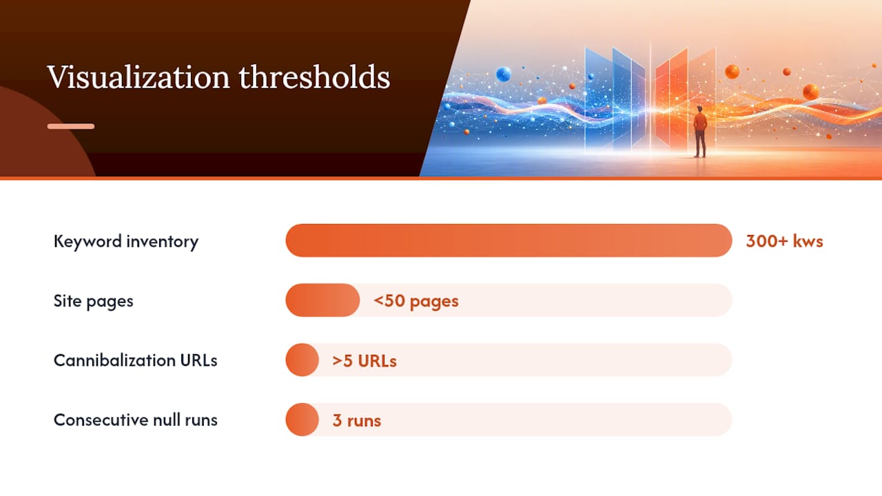
Visualization pays off when your keyword inventory exceeds a few hundred terms and you genuinely cannot see the cluster structure in a flat list. It also pays off when you need cross-team buy-in: a network graph or a word cloud communicates topical structure to a product manager or a CMO in 30 seconds. A spreadsheet does not. That stakeholder-communication value is real and often underestimated.
Where it becomes overhead is in maintenance mode. Once your clusters are mapped and your content plan is running, re-visualizing every month adds little. A spreadsheet filter on new GSC queries is faster and more precise for incremental updates. The quarterly full refresh is where visualization earns its place again, because that is when you are looking for structural drift, new topic clusters emerging, and cannibalization creeping in.
The decision heuristics I use:
- Visualize if: keyword inventory is 300+, you need stakeholder sign-off on architecture, or you suspect cannibalization across more than 5 URLs.
- Skip visualization if: you are doing incremental keyword additions to an existing map, your site has fewer than 50 pages, or you already have a validated cluster structure.
- Stop the project if: three consecutive clustering runs produce no actionable new clusters, or the team keeps reworking labels without updating any pages.
Visualization is a diagnostic, not a deliverable. When it stops producing decisions, stop running it.
Wordcloudgenerator turns your keyword list into a visual map in seconds
Most keyword-visualization workflows stall at the setup stage: configuring a Python environment, connecting API keys, or waiting for a platform trial to activate. Wordcloudgenerator skips all of that. Paste your seed keyword list or upload a CSV, apply stop-word filters to remove noise, and you have a high-frequency theme map in under a minute, no account required.
For the 6-step workflow above, Wordcloudgenerator fits directly into step 2 (clean and enrich) as a fast theme-extraction layer. The PNG and SVG exports drop straight into a stakeholder deck. The top-terms CSV feeds your cluster-labeling step. Choose from 26 fonts and 12 color themes to match your brand before exporting. The core tool is free; create an optional account to save and revisit projects.
Try the free word cloud generator with your next keyword export and have a presentation-ready visual ready before your next meeting.
Sources
- How to Do Keyword Mapping for SEO (+Free Template) | WordStream
- Keyword Mapping: A Beginner’s Guide
- keyword-clustering/keyword_clustering — GitHub